 Analytics, Metrics and Music for the Radio Industry
 An Indie Artist Pipeline to Internet Radio
 Radio Industry ROI Strategy
 A New Breed of Indie Artists
CBS "YourDay" Good First Try
I've long been an advocate of the radio industry using the internet in a way that best serves consumers. This thinking has always been at odds with radio's propensity for using the internet as a promotional tool - aggravating the user's online experience with web sites which look like someone just threw sh*t on the wall to see what sticks.
| "...CBS Radio brings together a number of items an audience desires in one location." |
The history of radio's use of the internet has been marred by web sites crammed with garbage, exemplified by multiple colors, fonts, pictures and too many words to easily digest. It's been an across-the-board complaint. No radio industry group has been able to capture the simplicity of what major internet players like Google, Amazon, Pandora, etc., have done - until now. |
On May 21 CBS Radio introduced new "YourDay" online destinations for iPad users, across 24 of its markets. Now that I've had a chance to look closer, it's time to report that we finally have a good first try from the radio industry (using a concept designed by the radio industry). I throw in the latter comment in parentheses because something like iHeartRadio is not created by radio. It is a copy of Pandora's approach. Copying what others are doing is what's held radio back for so long.
CBS was a long time coming into its own with "YourDay." As recently as May 27, 2009, long after it bought CNet News (owner of Radio.com), I pointed to how ironic it was that a radio company owning the "radio.com" domain name had still not used it for anything other than a page that served placement ads. You can see an example of this here, because CBS Radio still has not acquired the domain name "YourDay.com." So what's found there is a series of paid links, including one answering the important question "How Do I Know I Ovulate?"
But we'll not digress. This is about the "YourDay" iPad app that is actually quite nicely done. Though it has shortcomings, as anything new will, the concept is one which shows how NOT concentrating on promoting a single station's web site is key in serving a community online.
In the case of "YourDay," CBS Radio brings together a number of items an audience desires in one location. Most importantly, it does not try to squeeze too much content onto one page so as to overwhelm the visitor - a radio industry problem that's been written about frequently here at Audio Graphics.
Here is the "YourDay Cleveland" home page this morning. (I'll apologize, as my camera's time/date stamp is off in each of the following pictures and indicates yesterday's date.) Click on any picture to see an expanded view.
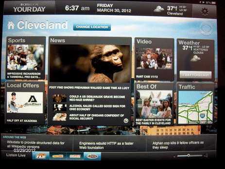
This is the menu selection of pages offered at "YourDay."
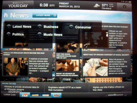
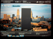
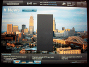
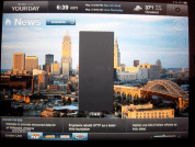
You can take a trip through the rest of "YourDay Cleveland" by clicking on the thumbnails.
News Page |
Sports Page |
Music News Page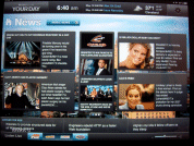 |
Weather |
Traffic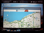 |
Local Offers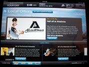 |
| Weather, Traffic, and News categories are adequately filled, while we have the "Music News" section with plenty of non-music news, and the "Local Offers" page lacking both offers and anything local. |
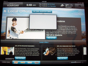 |
As stated above, this is a good first try. My only problem is that I'm a firm believer in never putting anything online that isn't ready; in this case, there seems to be nothing in place for aggregating information in the "Politics," "Business," and "Consumer" categories, as each are empty. Hopefully this is a short-term problem.
 |
 |
 |
On a positive note, we are beginning to see the radio industry realize that the internet's purpose is not solely about promoting itself (or stations). I cannot think of a better signal that radio is finally understanding why consumers come back to a web site.
Each of the "Your Day" iPad sites has a link to audio of the market's CBS radio and TV stations - an admirable way to offer online audio and video, without beating the user over the head that "we have a stream."
Compare what's above with what other radio groups offer online. If your station web site is not as streamlined, content efficient, and easy to navigate as this, you are not giving a maximum experience to your visitors. It's time to change. (It would be nice to see CBS Radio bring this style of presentation to its web sites accessed by non-iPad users.)
Good job CBS Radio! You've done the radio industry a service with this approach to using the internet. What company will be next?


