 Analytics, Metrics and Music for the Radio Industry
 An Indie Artist Pipeline to Internet Radio
 Radio Industry ROI Strategy
 A New Breed of Indie Artists
What is Found in these Numbers?
They're back! Once again we have Triton Digital Webcast Metric's stats to kick around. And, once again, the numbers show the same radio industry companies out front - and all are trailing Pandora.
Each time a Webcast Metrics is released I put together the data in a way that allows you to see the deeper picture. Download these spreadsheets free.
As an example, let's compare the Katz Radio Network's online audience with Pandora - using the basic Monday-Friday, Average Active Sessions. Note that I'm not picking Katz Radio Network because of inadequacies in what they do, but because it represents nearly all the big radio industry players. That said, Katz Average Active Sessions are 27.2% of Pandora's. Said in a different way, Pandora's Average Active Sessions are 336.5% larger than those station represented by Katz.
| "There's so much more to the Triton Digital Webcast Metrics than is reported, and I'd like to see the radio industry dig much deeper into the meaning of what's served." |
There's obviously a game of catch-up in progress, which we see mentioned in various ways throughout radio industry trade magazines; the most prominent are about iHeartRadio's upcoming concert, and the amount of airtime which will be devoted to it and iHeartRadio. What's not really being talked about is how those online stations backed by a radio station have the advantage of promoting their URL, while Pandora relies on word of mouth and those brief shots of its icon sitting on a dashboard in a number of television car commercials. |
While everyone watches "who is out front" I'm going to go in another direction. Reason is, which place each radio company finishes this race in is not going to drastically change.
What I'd like to concentrate on are four areas that don't get much attention:

 Month-to-Month Mon-Fri Average Active Sessions
 Month-to-Month Mon-Sun Average Active Sessions
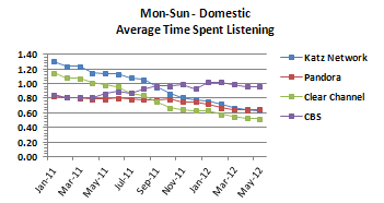
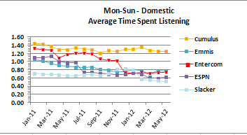
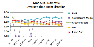
 Time Spent Listening
 Weekend Listening
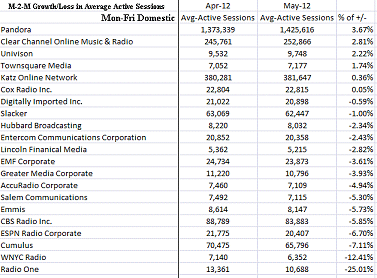
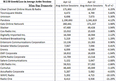
Digest what's happening with both Monday-Friday and Monday-Sunday Average Active Sessions by clicking on the following two graphics. In weekday listening, all but 6 parties are showing less folks out there from April to May. You may explain this as the onset of the summer doldrums - an anticipated online occurrence - but that may be placing value on false hope for 2 reasons:
|
1) While once dropping 20%-25%, that figure has dramatically been lowered with the use of mobile devices over the past few years. 2) This drop, for as long as I've been tracking it, normally occurs in June not May. |
The Monday-Sunday stats have 55% of the reported stations showing AAS increases. The Monday-Friday stats show only 28.5% of its lineup of 21 stations increasing AAS. (Click each chart to enlarge.)
Now, turn your attention towards Weekend Listening. Notice what percentage of Pandora's "Total Session Starts" come on Saturday and Sunday. That's guidance on how people use Pandora, something that seems to be slipping through the cracks in radio industry trades.

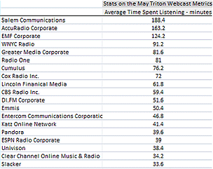
Time Spent Listening is another clue. View, below, where each groups sits (reported in "minutes"). Click the graphic to enlarge the image. Download the free Audio Graphics' breakout of Triton Digital Media's Webcast Metrics here.
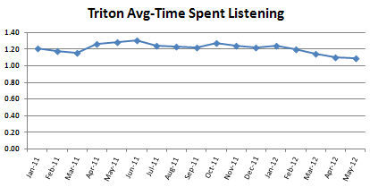
Viewing these next charts shows there appears to be a leveling out of this drop, but that doesn't lessen the concern.
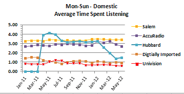
Now, look at the total group of stations reporting to Triton Digital.
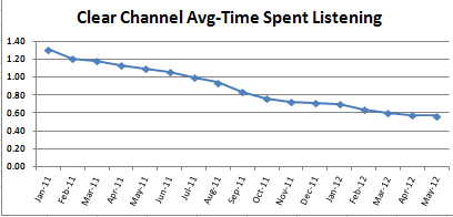
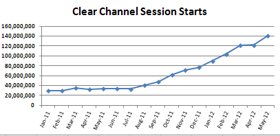
Using Clear Channel, view how this slope is opposite of its session charts.
There's so much more to the Triton Digital Webcast Metrics than is reported, and I'd like to see the radio industry dig much deeper into the meaning of what's served. However, as with the Arbitron reports, radio execs are so caught up with "who's in front" that they miss the nuances of what being in front means (when coupled with ancillary data).
Online gives us ways to look at audiences that have never been available. It's time to begin digesting the options because just staring at who's leading means little online.
Go here to download your free Audio Graphics analysis of the Triton Digital "May 2012 Internet Audio Top 20 Rankers."
Return to AudioGraphics.com each time there is a new "Internet Audio Top 20 Rankers" released from Triton Digital. Doing the breakout for you, I show what the radio industry is doing online in more detail than is available from any other source.
Click here to receive a FREE breakout of this report sent to you for each ranking month. It includes all groups in the publicly-released Triton Digital Ranker.
Note: For caveats pertaining to this month's release, please view the bottom of Triton Digital's report.


