| Monday, September 15, 2014 |  |
 |
 |
|
Hear Today's Songs |
 |
 
 
 |
 |


 A New Breed of Indie Artists
 Free Music and Programs for Radio and Podasters
Caution in Reading Online Radio Numbers
|
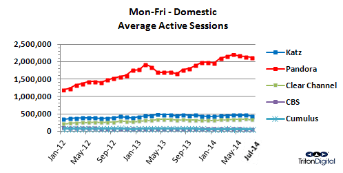
Triton Digital's Webcast Metrics for July was released last week. No surprises. Pandora is still high. Cumulus and CBS are low, and Clear Channel is hovering just North of 15% of what the big "P" delivers in Average Active Sessions. For those keeping score, Clear Channel is 73.8% of the reported Katz Digital Audio's total. Add to Clear Channel's AAS numbers, Glen Beck's "The Blaze." (For reference: "The Blase" showed 5,812 and 5,697 AAS respectively for February and April, the last two months data was available.) (More qualifiers for this month's report are here.) |
"This is the most difficult concept for the radio industry to wrap its head around: What you see here is a miniscule portion of data, limited only by the analyst's creative use of the facts." |

Download a deep data dive of the July report.
It's been said many times. If all you do is glance at the report, there's not much information relative to how the online radio community is operating.
This month there was something that also caught my eye which I thought worthy of comparison. Triton Digital released this comment within the framing of its report: "Mobile devices made up 68% of listening on Triton in July (M-F 6A-8P)."
Sounds like a lot, so I looked at what Audio Graphics' RadioRow was doing in that area and came up with a slightly different picture: 40.3% of access to RadioRow was done using mobile in July. Of this, the break is as follows:
 61.7% of mobile was generated over an Apple device:
 51.9% iPhones
 8.1% iPads
 1.7% iPods
 35.4% of mobile access used Android
In total, 335 different types of devices were used to access RadioRow in July. I hope this begins to drive home the diversity of units that consumers are using to get to their audio, online.
Just take a moment to let the above sink in, because it's only part of thousands of data points available to help in programming - or in delivering advertising.
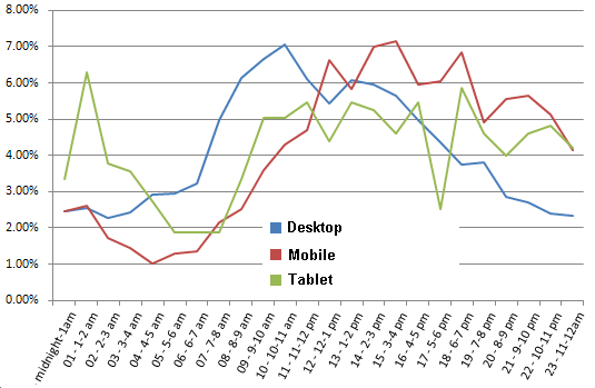
Then, leave digesting this chart. It represents other data points which can be used - when the industry gets ready to move into digital. This is part of "Big Data," a term that's now used to define crunching the numbers to find more options.

This chart represents the portion of a total day's visits that come to RadioRow, via a desktop, mobile device, or tablet, over the course of 24 hours.
While "Mobile devices made up 68%..." of Webcast Metrics listening, it becomes obvious that other forms of audio delivery bring in different segments of users. This is the most difficult concept for the radio industry to wrap its head around: What you see here is a miniscule portion of data, limited only by the analyst's creative use of the facts.
There are answers on what works, what doesn't, and sometimes on improving what you do when using charts like these.
To date, though, use caution when reading online radio numbers. Unless you take the deep dive, there's not much to sink your teeth into.
More Articles
Today's indie introduction is to...
| Country artist Genevieve Allen |
 sample song |
Tequila Called Download Song
|
Give Genevieve Allen's "Fine Ol' Time" a listen.
Add it to your playlist, free!
 |
 |
 |
comments by Disqus |


